Win £100 with TemplateCloud!

The TemplateCloud library is rapidly growing and we are fast approaching our 10,000th design upload! We currently have just over 9,900 approved designs and we want to celebrate this next landmark with you by giving £100 to the designer who uploads the 10,000th approved design addition to the TemplateCloud library.
Is you design already in the TemplateCloud design approval queue? If so you are in with a chance of winning £100 cash prize to be announced over the coming days. If not upload your latest design today to be in with a chance of winning.
Happy designing!
Practise Your V Layer Designing Techniques
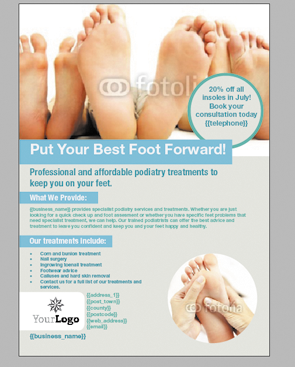
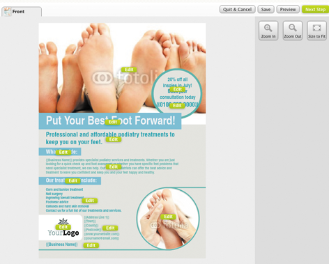
To help you get to grips with our V layer technology, we’ve put together a simple step-by-step tutorial for you to practise on. This tutorial will walk you through the necessary stages to build a single sided A5 leaflet designed for a podiatrist. This leaflet uses V layers to create both a circular image and has a second image which features a circle shape overlaying the image. You can see what the final layout for your tutorial design should look like to the left.
To get started, download the InDesign files for the tutorial here and follow the instructions below.
How does it work?
To create a V layer you need to create a mask (or masks) of the shape you want to use and place it on its own layer. ‘Ë?V’ stands for vector which means that anything on a V layer must be a vector object – you cannot use images, EPS files or other graphic elements on a V layer.
Before you attempt our V Layers Tutorial, make sure you have read this post to help you understand the basic V Layer design rules.
STEP 1 – Punch out a shape
Firstly you need to make the shaped, circular image in the bottom right hand corner of the design. To do this:
 – Create a light grey rectangle the size of your A5 document.
– Create a circle shape at the size you wish the circular image to be (approximately 58mm in diameter).
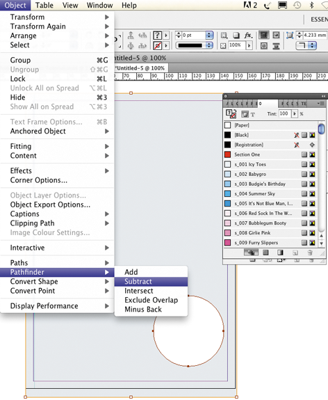
– Place this over the rectangle at the point where you want the image to be displayed. Select both the rectangle and the circle and go to: Object > Pathfinder > Subtract in InDesign to ‘punch out’ the circle from your rectangle (below image).
– Create a new layer and call it ‘v_layer 1′ and place the rectangle shape on to it. Place the smaller foot image on its own layer called ‘Ë?Image 1′ and ensure it is below your new V layer.
– Put the 3 blue rectangle boxes for the text headers on to their own individual V layers (ie. ‘Ë?v_blue box 1 etc.). These should be above ‘v_layer 1′ in your layers palette and each text box will need to be above its V layer in the layer palette stacking order (see image to the right).
Don’t forget, only one element per editable layer.
STEP 2 – vector element over an image
Next you need to place a circular vector with text over an image. To do this:
 – Place the larger image with several feet at the top of your InDesign document so that it spans the full width. It should be on its own layer (eg. ‘Ë?Image 2′). Make sure you leave the white box behind it on the background, this acts as a white ‘canvas’ behind the image in case the client deletes it.
– Create a turquoise blue vector circle and put it onto a new V layer (eg. ‘v_layer 2′)
– Create a slightly smaller grey circle and position it on top of your turquoise circle. Again put it on its own individual V layer (eg. ‘v_layer 3′).
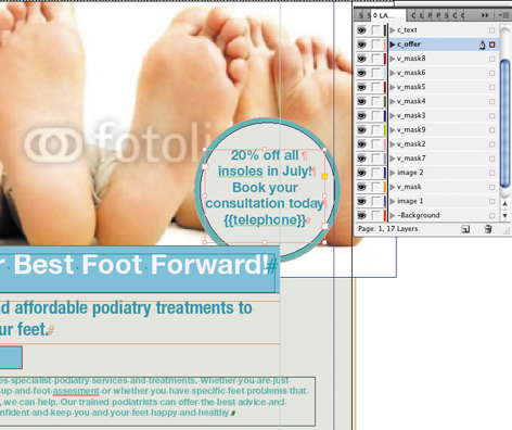
– Position the promotional text box above the two circles on its own layer (see image to the left). Consider using Copyfit to give end clients more editing flexibility.
STEP 3 – check, finalise & upload
Once you’ve positioned all images, text boxes and V layers as described, separate out the remaining elements onto layers and check the layers palette to ensure they are in the right order.
- Images should be below V layers
- Relevant text boxes should be above V layers
- Anything that overlaps a V layer must be editable or placed on another V layer
If you want to use non-standard shapes (eg. rounded corners, stars etc.), you will need to draw these yourself as no InDesign Object Effect or Corner Effect options are allowed on a V layer. A white vector rectangle with rounded corners has already been provided in the tutorial InDesign file for you to place the placeholder logo on (don’t forget this will need to be a V layer as it is placed over another V layer in the layers palette).
This is how your final design should look at the ‘Try Template’ stage (see image to the right above).
Use the Final Checklist below before uploading your design. When you upload and build your design, name it using your name and ‘V Layer Test’ in the title so we know to remove your design from the Design Approval List.
V Layers Final Checklist:- Label your layer as v_ (v_layer 1 for instance)
- Only use vector shapes on V layers
- Only one item per V layer
- You can have more than one V layer per design
- Position any images that are to be editable through your V Layer below the V layer
- Remember that V layers aren’t editable by the end user
 We’ll pay £500 each month for your designs!
TemplateCloud is an online marketplace where graphic designers – like you – can upload designs and earn unlimited royalties. You create designs for Flyers, Leaflets, Business Cards, Stationery, that kind of thing, then we turn them into editable templates for sale online.
We’re unique.
We sell your design templates via different websites across the world. Each time a customer uses your design, we pay you a royalty. We’ll also prepay you £5 each submission for up to 100 designs each month- that’s guaranteed.
Getting started is easy, you just need Adobe InDesign and an internet connection, then just get creative.
If you need help with resources, you can even use Fotolia images. Just choose from millions of images in the image library and use them in your designs – for free! Read this article for more information.
So what are you waiting for? Visit TemplateCloud.com and start earning a guaranteed income for your designs.
Terms and Conditions:
1. One account per contributor. 2. Limited time offer. Applies only to designs supplied and approved up to 31.12.2012. 3. Payments can only be made directly into bank account provided. 4. All sales Royalties earned from the sale of designs pursuant to the template supply agreement will be offset against the total Advanced Template Royalties paid. 5. You may not terminate the template supply agreement until Template Royalties in respect of each design supplied pursuant to this promotion exceed the advance payment. 6. Offer limited to a maximum of 100 designs per contributor, per month, approved and accepted by us at our discretion.Your designs now selling on Need A Print
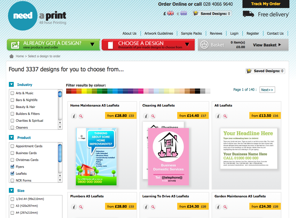
We are pleased to announce that the TemplateCloud design library is now selling on needaprint.co.uk and needaprint.ie!
The library went live on the sites earlier today meaning that your designs are now selling to an even bigger UK and Irish audience. This increases your opportunities to sell royalties from all your existing designs as well as any future designs you upload to TemplateCloud.com.
You can take a look at your designs on the Need A Print websites today at needaprint.co.uk and needaprint.ie.
Festive Design Ideas
 At TemplateCloud we are fans of forward planning so we have been looking ahead at the next couple of months to see what type of designs clients might be looking to buy over the festive season.
Lots of you have already been uploading Christmas card designs ahead of October and November sales. As well as sending festive greetings, many companies, small businesses, communities and organisations also use flyers and leaflets to promote other events and traditions. Why not consider:
Christmas parties and events
As well as promotional designs for the obvious Christmas Eve and Boxing Day events at bars and clubs, don’t forget about other businesses that may offer Christmas catering, venue hire or fancy dress hire. Restaurants also often do set price menus in the lead up to Christmas with advance bookings and discount for large parties or Corporate bookings.
Christmas Craft Fairs
Very popular events for artists, craftsmen and venders of fresh produce. Make sure you include an area for a list of what’s available to buy and do on your design as well as location and dates for the event.
Christmas Carol Concerts
Whether they are a free community event or a professional carol service, carol concerts still need promoting to draw in the festive crowds.
New Years Eve
As with Christmas events, New Years Eve is a big event for the bars and clubs so promotional New Year designs for this sector are always popular. Again many restaurants and smaller venues also offer evening packages such as set price menus or evening entertainment to bring in the New Year.
January Sales
One of the big annual events in retail! Don’t forget that other industries also run their own equivalent to a January Sale. This can be in the form of general discounting across products and services or more value adding such as no inscription fees for educational courses booked in January or 3 courses for the price of 2 in restaurants for example.
New Years Resolutions
Businesses often appeal to clients’ good intentions at the start of the new year. Headlines such as ‘New Year, New You’ are very common with gyms and the health and beauty sector. It’s also a prime time for home renovations and decorations with people looking to the coming year and reassessing their home environment. Don’t forget to include an area for a discount or similar promotion to help draw in clients.
January Blues
We all suffer from them and some sectors angle their marketing material at the start of the year to offer products and services to help clients ‘Beat the January Blues’. These are usually sectors linked to leisure, travel, health and well-being such as spas, beauty salons, gyms, holiday and travel agencies, comedy venues and bars.
Dont forget to use the TemplateCloud Tactics for every design you do to give your designs greater selling power.
Happy designing!
We’ll pay £500 each month for your designs!
 TemplateCloud is an online marketplace where graphic designers – like you – can upload designs and earn unlimited royalties. You create designs for Flyers, Leaflets, Business Cards, Stationery, that kind of thing, then we turn them into editable templates for sale online.
We’re unique. We sell your design templates via different websites across the world. Each time a customer uses your design, we pay you a royalty. We’ll also prepay you £5 each submission for up to 100 designs each month- that’s guaranteed.
Getting started is easy, you just need Adobe InDesign and an internet connection, then just get creative.
If you need help with resources, you can even use Fotolia images. Just choose from millions of images in the image library and use them in your designs – for free!
Read this article for more information.
So what are you waiting for? Visit TemplateCloud.com and start earning a guaranteed income for your designs.
Terms and Conditions:
- 1. One account per contributor.
2. Limited time offer. Applies only to designs supplied and approved up to 31.12.2012.
3. Payments can only be made directly into bank account provided.
4. All sales Royalties earned from the sale of designs pursuant to the template supply agreement will be offset against the total Advanced Template Royalties paid.
5. You may not terminate the template supply agreement until Template Royalties in respect of each design supplied pursuant to this promotion exceed the advance payment.
6. Offer limited to a maximum of 100 designs per contributor, per month, approved and accepted by us at our discretion.
Need some inspiration?
 To help give you some new ideas for putting together your TemplateCloud designs, we’ve written some design briefs to help get you off to a quick start.
 These briefs feature header, subheader, body copy and design ideas for specific sectors. The industries featured are those recently requested by end clients looking to use TemplateCloud designs on their marketing material.
How to use V Layers in your designs
We’ve added some new functionality to TemplateCloud that along with the new image library will help you make your designs even more flexible for the end user and help you sell more of your designs. It’s called V layers.
V layers mean that you can create irregular shaped editable images as well as having editable images behind locked vector graphics. The result of this is that elements such as images can now be editable along with overlaid text.
So how does it work?
It’s really easy to add this versatile function to your designs. All you need to do is create a mask (or masks) of the shape you want – essentially a vector object on it’s own layer. For example, in this design I’ve created a simple cyan rectangle in InDesign and then punched out 4 circles using the Objects > Pathfinder > Subtract tool:

Next, create a new layer. The layer should be labelled starting with ‘v_’ this is a v_ layer. V is for Vector (not versatile, but it sounded better as a header). Put the mask shape or vector object onto this layer. Your label should be labelled, for instance v_Mask 1. The three images in this example are then placed behind the mask in the layer order like this:

Once your V layer is in place you can then add your editable text as normal above it. The example above has more than one V layer.
The extra layers (coloured in brown) are for the white circles and the white lines on the artwork. You can add as many V layers as you like, but you can only have one vector element per v_layer.
This is how the same file looks to the end user:

Using a V layer gives you a great deal of creative flexibility when building your designs. For example the design below uses vector objects as V Layers that overlay an image, making the image behind editable. The two blue shapes are locked and the text on top is also made editable:

So here the image is editable and so is the ‘Need to get fitâ?¦â? text.
Key points:
- Label your layer as v_ (v_mask for instance)
- Only use vector shapes on V layers
- Only one item per V layer
- You can have more than one V layer per design
- Position any images that are to be editable through your V Layer below the V layer
- Remember that V layers aren’t editable by the end user
Any questions post them below. Happy designing!
Get Your Template Building Tactics Right!
 How do you increase the chances of your designs selling? A question we get asked all the time by our Clouders. So we’ve spent some time looking at what sells and the characteristics of these designs. What we’ve come up with is the TemplateCloud Tactics. Design by these simple rules and you may see your designs selling even more.
T: Targeted
Be Industry Specific. Think carefully about the industry or sector you are designing for and spend some time researching before starting your design. For example:
Plumbers, Mechanics, Dentists, Beauty Salons, Dog groomers, Ironing services, Painters & Decorators, Accountants, Hairdressers, Electricians, Gardeners, Cake shops, Children’s entertainer, Solicitors, Builders, Estate Agents
To name but a fewâ?¦.
All of these different industries will have different messages they’ll want to convey. Consider what type of messages they are most likely to send and what they will want to include in their marketing such as photo examples of their work, list of services or industry accreditations. Your research should also look at what advantage they may offer to clients over their competitors and what colours, look and feel their collateral should communicate.
A: Adaptable
Make as many editable elements as possible. This allows greater flexibility for the end users allowing them to personalise their designs and tailor them to their business and local market. Unless there is a valid reason for making something fixed, don’t. Remember the new v_layer functionality allows you to create editable images underneath editable text and shapes. Read more about that here. If you’re not sure ask us.
C: Content driven
Create good content. Don’t just put a ‘Put text hereâ? layer. Think about what you would put if you were designing this for the client. Other than contact details, most end users only make minor text changes to existing copy within a design. End users are therefore more likely to buy a design if it uses good copy that’s relevant to the sector they work in. Add some relevant text or a key message as well as making sure the all-important heading for your design is pertinent and demands attention. The header will be the first thing end-users and their clients see and you only get one chance to make a good first impression.
T: Technically Sound
Get the basics first. Use the starter guide initially. Carefully read it and use the checklist on the back cover for every template you build to make sure they will work correctly once uploaded. Consider usability for the end user as well when setting text frames etc. to make sure your templates function with the greatest of ease for customers.
Keep checking our blog for new developments and features you can use in your templates, our systems are constantly updating and evolving to give you greater flexibility with your designs. Once you’ve mastered the basics, have a look at the Advanced Guide for more cool stuff you can do.
I: Image based
Our most popular designs centre around one or two large images – big images sell! So using an image as the focus of your design will appeal to end-users. You can use your own image or choose one from our TemplateCloud Image Library, the end-user can then choose to use your suggested image or replace it with their own image. Read more about how to use the TemplateCloud Image Library here or in our Template Creation Guide.
Remember you can now add editable text over an editable image or use shaped masks by mastering v_layers. Read more about that here. If you’re not sure, ask us.
C: Colourful
Your design will go head to head with hundreds of other designs on-screen, and the more colourful it is, the more likely it is to draw attention. Think about colours which compliment the industry you are designing for such as relaxing greens and purples for a spa.
Contrasting colours make important details stand out and can help make promotions and phone numbers jump off the page. Play carefully however, there’s a thin line between colour contrast and colour clashingâ?¦
S: Selling power
If you follow the above formula, your template should have a greater selling power for both you and any end user who purchases your design. But to really boost the likelihood of a sale, your design needs to follow a basic marketing principle called A.I.D.A. Run all your copy through this simple magic formula below to ensure your designs get a higher response. This formula is a great tool for writing powerful sales letters and killer copy:
Attention
Attract your reader’s attention with an exciting headline. Make them intrigued, just by reading it. Either reveal or conceal a common interest. For example:
‘How to Make Yourself Irresistible to Ladiesâ?
‘Want to Retire at 50?â?
‘Don’t Make These Common House-Buying Mistakesâ?
Interest
Evoke interest from your potential customer by telling them multiple, life-enhancing benefits. Steer away from just listing features. Use simple, short sentences and talk to them as if they’re sitting next to you.
Desire
Make them want it. Make it irresistible. Give them guarantees of their money back. Or extra special bonuses or discounts. Don’t forget to state the urgency – make your offer timebound. You could try ‘Order within 7 days and get this free pen set. If you’re not 100% satisfied, we’ll refund you in full.â? A good deal makes something more enticing but of course make it editable so end-users can tailor it to their needs and business offering.
Action
Tell them what to do! You’d be amazed how much sales literature misses the vital step. Don’t assume people who see your design will know what to do, make it clear what the next step is and make it stand out. Point them to the sales process  and get them to ‘call for a no-obligation quoteâ? or ‘Call us to place your orderâ?.
So, there it is. Stick this on your wall, engrave it on your pen, write it on your monitor – whatever you do, just don’t forget A.I.D.A. It’ll make you a better writer.
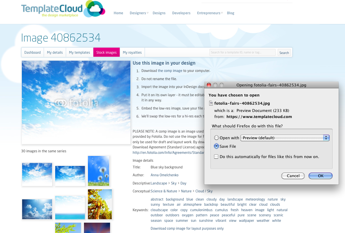
How to use stock images
These images can only be used as editable images and cannot be placed on the -Background layer. The images are named in a special way so don’t rename them and do not modify the image in any way.
We’ll replace it with the high res image when your template is used by a customer on one of our retail partner websites.
To watch an onscreen demonstration of this process, watch the How to Use Stock Images in Your Designs video.
