How to use text in your designs
Non-editable text
On the -Background layer you can use any font you like, just ensure all fixed text is on the lowest -Background layer and converted to outlines.
Editable text
A special ‘server’ font license is required for editing templates. We’ve bought this license for over 1,000 fonts from Linotype which you will need to use for editable areas. You can view or download a full list of this library here.
If you don’t have the exact font on your system you can choose a font with the same name. You will then be prompted to replace it with the Linotype version when building your template via TemplateCloud. For example, use any Frutiger Roman you already have and substitute it with Frutiger LT Pro 55 Roman from the Linotype Originals Library when uploading.
We can only substitute a font if there is an equivalent in the Linotype Originals 2.0 Library. So don’t use a font like Meta – find something similar from the library.
All editable fonts need to be set as a paragraph style in InDesign and named with their font name so they are identifiable. This includes any non-Linotype fonts you intend to replace at the upload stage.
Editable text cannot use special effects and requires certain settings to be applied in InDesign. Read through the list below carefully to make sure you respect all of the editable text requirements:
- Don’t outline text (don’t convert it to paths).
- Don’t use ‘Adobe Paragraph Composer’ justification – set to ‘Adobe Single Line Composer’ instead.
- Don’t use ‘optical’ kerning (use ‘metrics’ instead).
- Don’t use tracking (tracking should be set to ’0′).
- Don’t scale, skew, compress, squash or expand.
- Don’t use any special character effects such as all caps, small caps, superscript,subscript, underline, baseline shift, strike through, ‘forced’ bold, ‘forced’ italic or outlined.
- Don’t use paragraph hyphenation.
- Don’t use soft returns.
- You can’t use text attached to paths.
- Multi-column or linked (threaded) text frames aren’t allowed.
- Tables, bullets and tabs aren’t supported.
- Don’t use inset spacing (padding).
- Avoid Text Wrap.
- Don’t rotate text within a text frame (although its fine to rotate the whole text frame).
- Don’t use non-rectangular text frames.
- Don’t use tint swatches or gradients swatches.
Setting your text frame
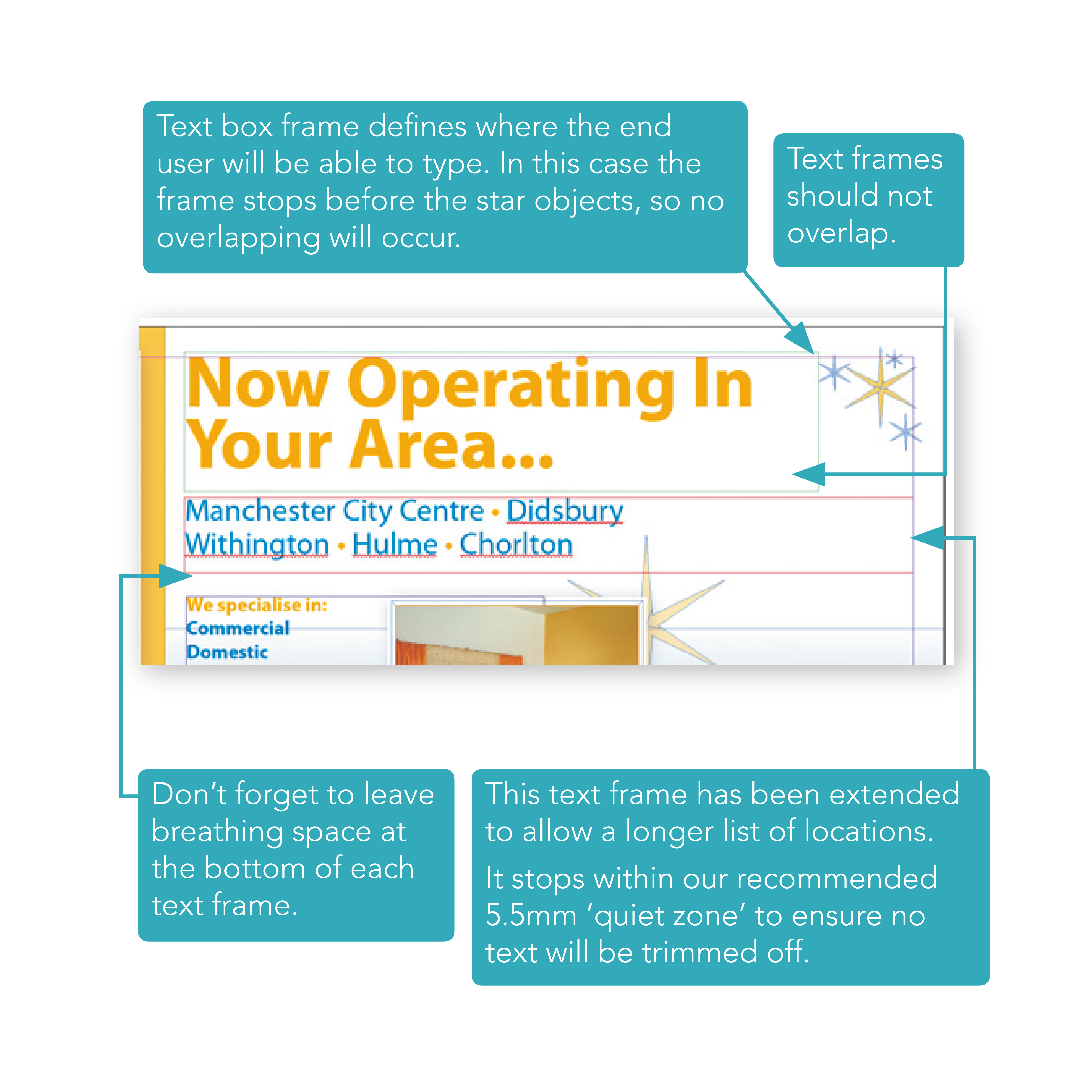
Define your text frame so the user has as much room as they need to fit in the text they want to type (see the example in the below image). Be sure to set the end of the text box carefully so it doesn’t run over important design elements or run off the edge of the page.
Avoid overlapping editable text frames or images as it makes it difficult for the user to pick items to edit. All text boxes should be rectangular.
Set some breathing space
Expand the bottom of your text frame by around 25% of the height of the font. This ‘breathing space’ allows the editor to display descending characters.
To see an onscreen demonstration of this process, watch the How to Use Text in Your Templates video.

